Design notes of The Wavy
Inspiration from Blue Period, and Minimalism
The paper and its cover art pay tribute to Pablo Picasso’s Blue Period and serve as a love letter to the golden age of graphic design.
>> New: See also the featured news in InstituteQ—Finland’s National Research Institute. <<
Blue period
Blue period of Picasso is his 1901–1904 during his early career when he just became twenties. He navigated his new life as an emerging painter and a newcomer in Paris as well as a stranger from Barcelona. Many of his painting from this time are are characterized by monochromatic blue tones. These cool, overcast and gloomy blue hues are reflecting the somber blue shadows in Picasso as one of his best friends went to another world suddenly at that time. During this period, Picasso’s paintings often depicts the society’s everyday people and poor. These melancholy blue hues didn’t initially resonate with critics or buyers, which gives Picasso hardship as the poors in his paintings, an empathetic suffering. It would be another three years before he would go on to develop his iconic Cubism.

late 1903–early 1904
Pablo Picasso
The Art Institute of Chicago
https://www.artic.edu/artworks/28067/the-old-guitarist
© 2018 Estate of Pablo Picasso / Artists Rights Society (ARS), New York
1903
Pablo Picasso
The Metropolitan Museum of Art, New York
https://www.metmuseum.org/art/collection/search/488596
© 2024 Estate of Pablo Picasso / Artists Rights Society (ARS), New York
The paper is also a newcomer to the field of 2D TMDC materials.
The blue and gray shades are captivating and were used in the figures to pay tribute to the characteristic tones of Picasso’s Blue Period.

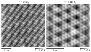
From the article Atomically Sharp 1D Interfaces in 2D Lateral Heterostructures of VSe2─NbSe2 Monolayers
© 2024 The Authors

From the article Atomically Sharp 1D Interfaces in 2D Lateral Heterostructures of VSe2─NbSe2 Monolayers
© 2024 The Authors
1950s–70s the golden age of graphic design
During the period, the world had changed a lot and were stepping forward to the next future. From Bauhaus, Modernist to International Typographic Style, various genres of visual languages and derivitives are seeding and springing in many places globally. Letters, elemental geometric shapes and pure color blocks create simple yet powerful visual impact. The tide swept through the graphic design industry, influencing posters, magazines and more. Fashion circles around and often retros these vintage and nostalgia back into the spotlight, turning them into neo modern tide. Notable examples are Helvetica Font (1957) and series design of Mexico 68 Olympics.
These graphic design languages also left their marks on the covers of many scientific textbooks.
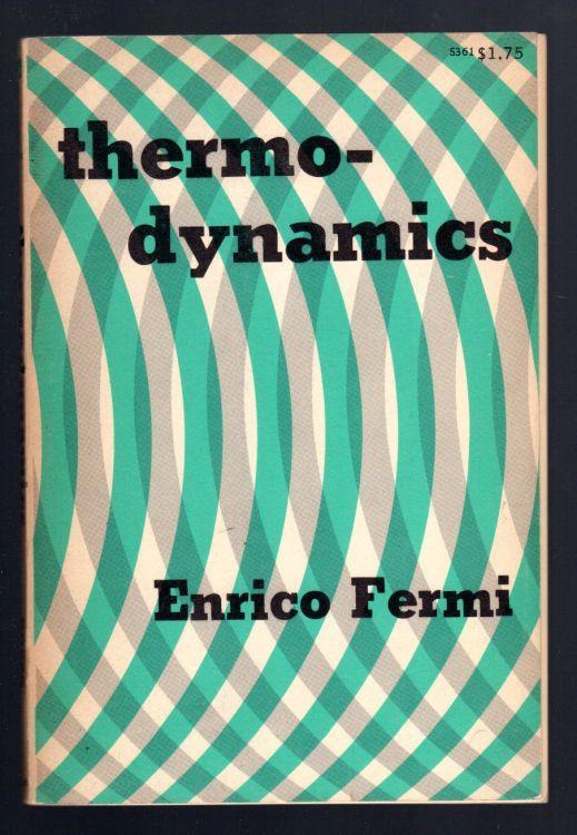
1956
The curvy lines show the heat exchange.
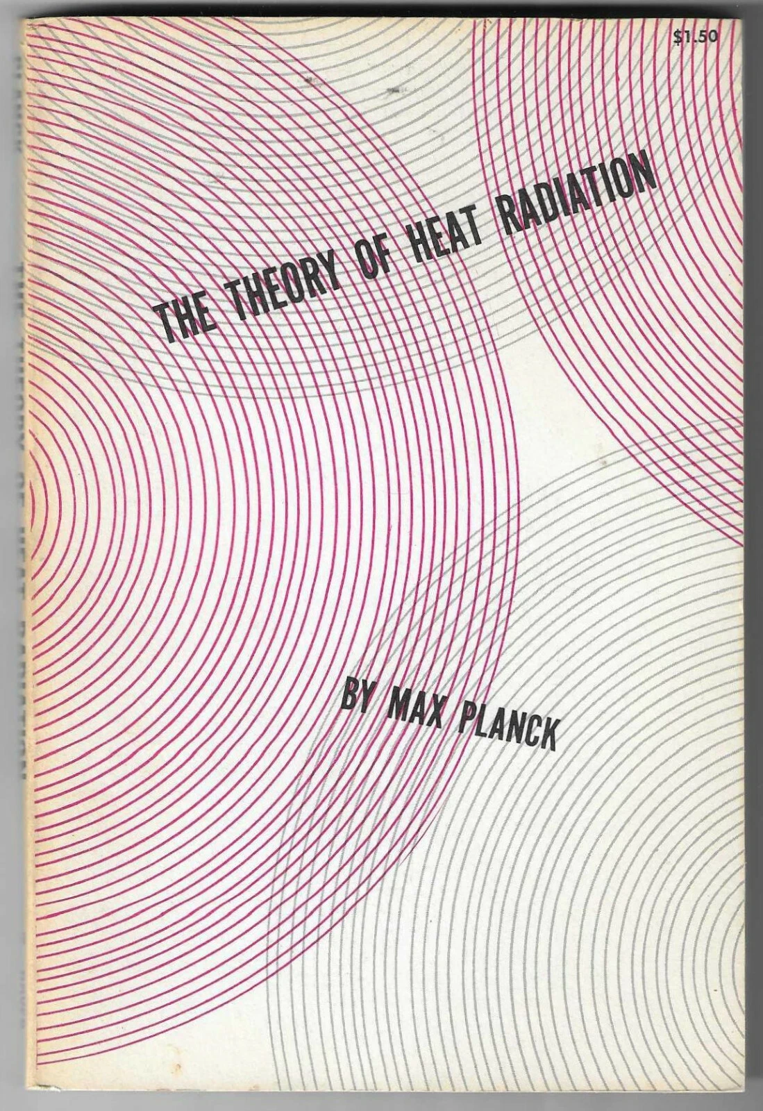
1959
The concentric circles represent the radiation in space.

1973
The chains of dots resemble monomers coming together to form polymers.

1964
The color blocks and lines depict chips and wires on a circuit board.
These geometric elements on the cover aren’t just decorative; they also communicate scientific messages to all people.
Our creation
Our cover art was designed with a planar style, reflecting the nature of our research on 2D materials in 2D world and their in-plane structure. Thus from the very beginning of the conceptual phase of the cover art, we boldly chose to forgo the 3D style ubiquitously seen in scientific journal covers today.
The blue and grey shades continues to be theme color, with a lighter taste to evoke a sustainable and eco-friendly aesthetic. The blue tones also serve to remind readers of Cherenkov radiation from electrons—exactly our research subject.
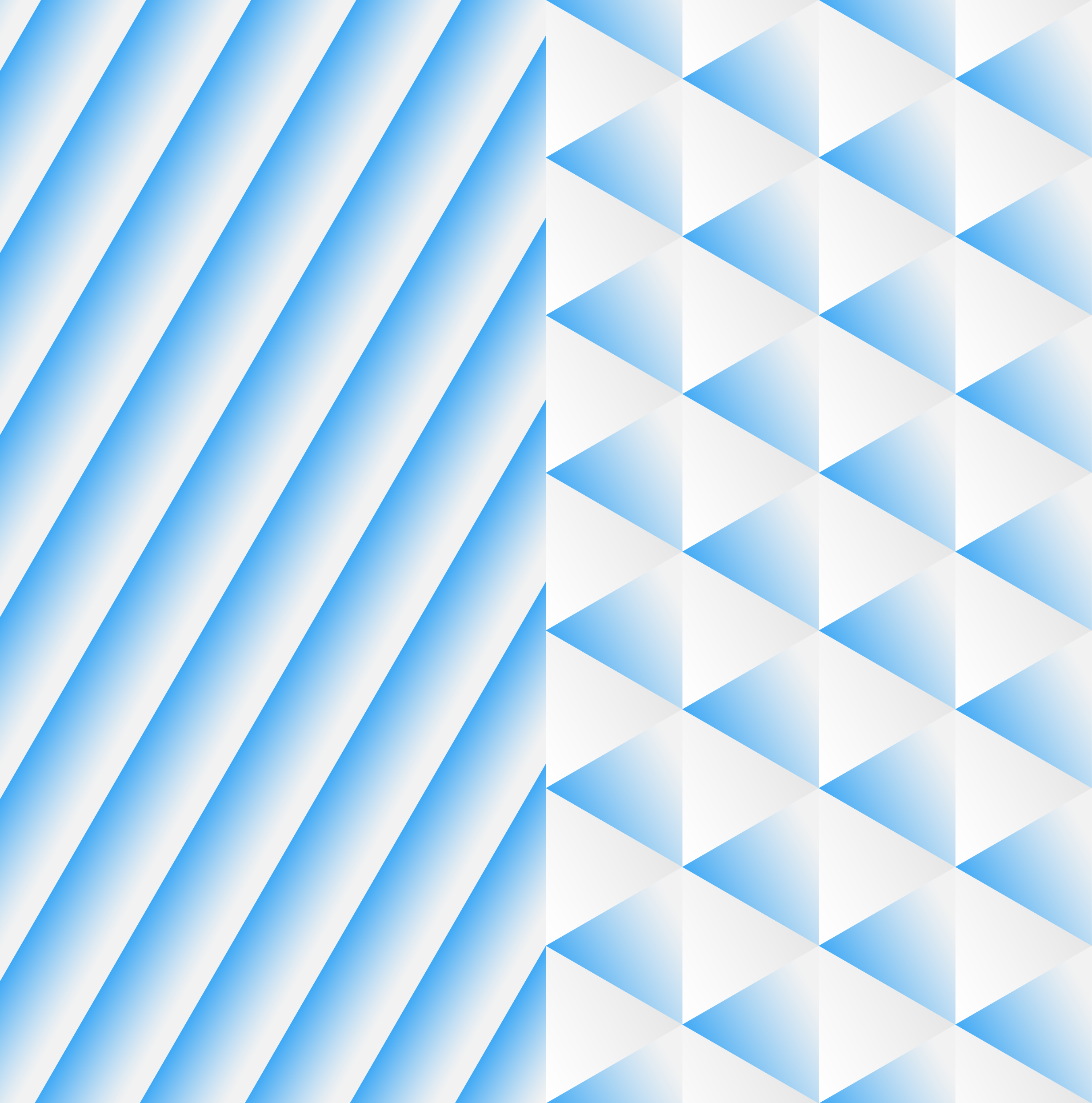
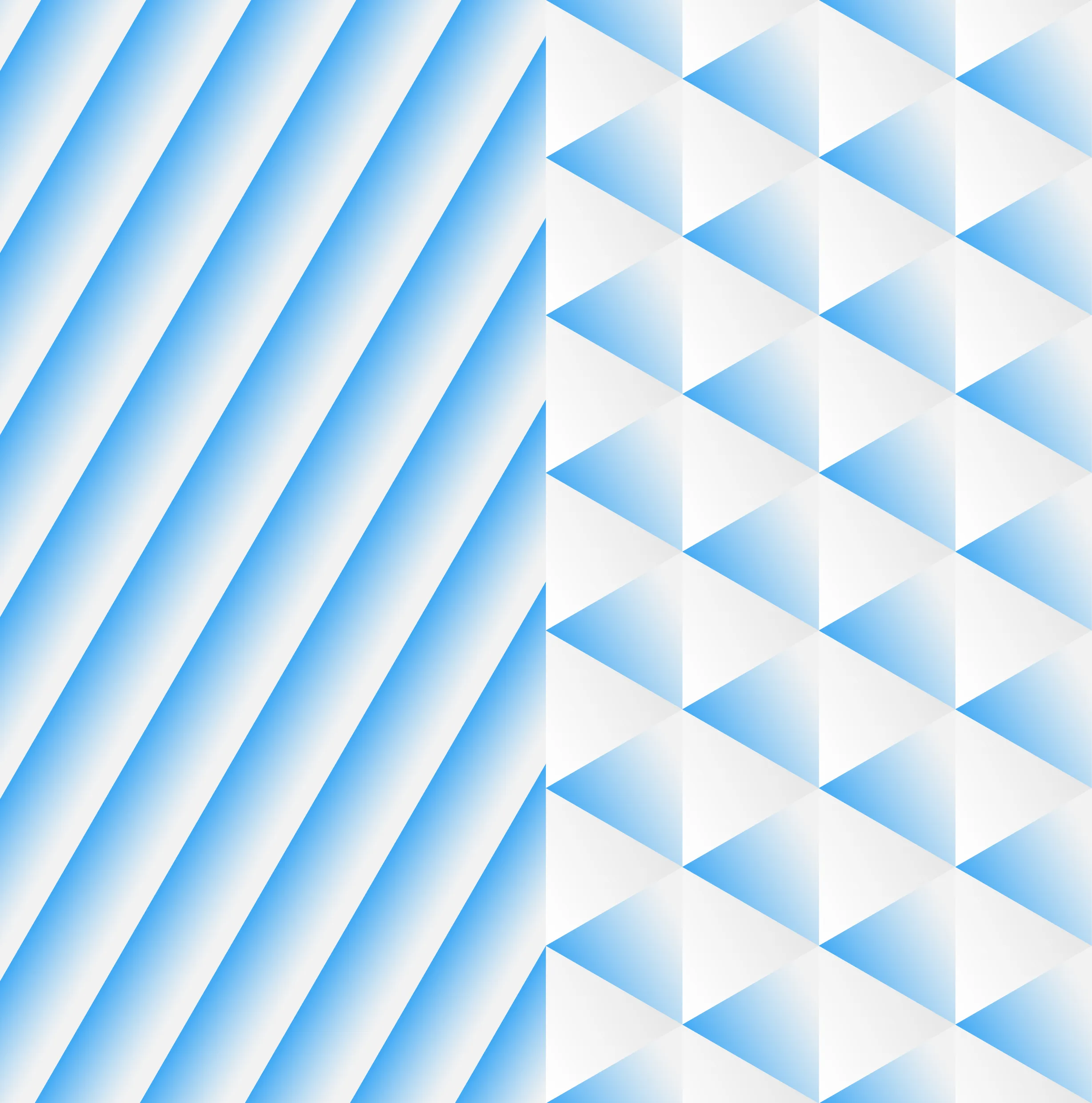
The stripes and triangles represent the distinct properties of the two materials, i.e. charge density wave (CDW) orders, with their sizes reflecting real physical size/ratio. The sharp feeling arises from both the acute angles and abrupt switches in the periodic pattern. The overall design is an abstract interpretation of the Table of Contents graphic of the paper.
One element in the design is not from the 1960s golden era but from modern times: the gradient shades. If you look closely, you’ll notice the white triangles aren’t purely white but have a subtle gray gradient, adding depth through light and shadow. This shading echoes the effect seen in Picasso’s Blue Period works. Picasso’s Cubism, which compressed 3D objects into a 2D flat dimensionality, also inspired us to pursue planar graphics over 3D renderings.
The design concept has been in mind for a long time, yet the cover art itself was completed in a single afternoon.
Finally, as reflected in the cover art’s title, The Wavy, our world is constantly in motion with turbulance. The world’s orders may be contrastly different, yet it doesn’t mean they cannot coexist—on the sharp contraty, they can live together harmoniously. Society experiences waves moving towards various directions, and when they meet, they don’t simply vanish. Instead, after interference and exchange, they continue on their endless journeys of exploring.

Credits
The cover art was originally created by HUANG Xin.
The cover is exclusively sponsored by HUANG Xin.
Post-credits scene:
Long long time ago, twisted bilayer graphene has been already invented in graphic design.

1962